Visual Communication for Low-Vision Information Access
When I magnify a chart enough to read one bar, the axis and legend can disappear from my view. I can see the bar, but I lose what it means.
I have albinism and low vision, and I use screen magnification every day. That gap between detail and context connects my research. Writing my doctoral symposium paper meant putting the connection into words.
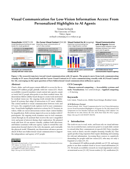
My paper “Visual Communication for Low-Vision Information Access: From Personalized Highlights to AI Agents” (Sechayk, 2026) was accepted to the UIST 2026 Doctoral Symposium. 🎓 In November, I’ll present it in Detroit to a panel of senior researchers.
What is a doctoral symposium? PhD students present their dissertation plans to senior researchers and get feedback while there is still time to change them. Think of it as a friendly stress test for the research.
Seeing a fragment at a time
Magnification makes things bigger by showing only part of the screen at a time. That tradeoff matters when information is spread across a page.
In a lecture video, an instructor can mark a sentence outside my magnified view. In a chart, I can see the bar under my pointer while its axes and legend sit elsewhere. Sometimes I don’t even know what I missed.
Using the vision we have
Many people with low vision prefer to use the vision they have. Speech, sound, and touch can also make visual information accessible, but they don’t directly support that way of seeing.
So what if we build on the vision people already use?
My research follows ability-based design: start with what a person can do, then shape the tool around their abilities. For me, that means working alongside tools such as magnification, allowing people to adjust the visual support, and designing with people with low vision. Their needs and strategies differ, and their vision can change with the situation.
Visual communication, in two directions
The thread that ties my projects together is visual communication in two directions. A tool can show me where to look with a highlight or bring missing context into my view. I can show a tool what I’m looking at by sharing my magnified view and where I point. What happens when both directions work together?

From tools that show to tools that see
My dissertation follows this idea step by step. Each project taught me something, and each lesson shaped the next one.
VeasyGuide: a highlight is a message
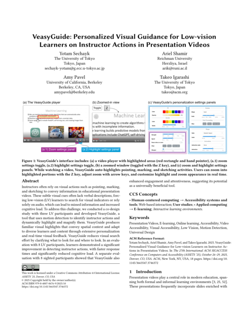
In a lecture video, an instructor may point to a part of a slide without naming it. VeasyGuide (Sechayk et al., 2025) makes that action easier to find with a highlight that can appear before the action and with magnification that can follow it. My co-design partners helped decide how the highlight should look and behave. You can read how we designed VeasyGuide or try it in your browser.

Takeaway: a highlight has to be findable, predictable, and adjustable to communicate anything. It should also leave the learner free to decide whether to follow it.
But a chart poses a different problem: the context I need is spread across axes, legends, and data points.
On-Cursor Visual Context: bring context into view
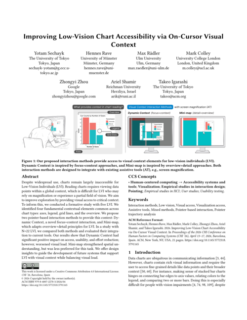
On-Cursor Visual Context (Sechayk et al., 2026) explores two ways to keep chart context available under magnification. Dynamic Context brings axes and legend information near the pointer, with a crosshair to help trace values. Mini-map keeps a small overview of the chart in view.
The crosshair came from a participant’s workaround: they used the edge of their docked magnifier as a ruler because the chart’s grid lines were too faint.

Takeaway: context can move into the magnified view, and people’s workarounds can show us how. But a fixed display can’t answer the next question a reader has about the chart.
Visual context for AI: let the tool see what I see
What if an AI assistant could see where I’m looking in a chart? In my ongoing work, I’m exploring an assistant that receives the user’s magnified view and pointer location as context. That lets a person point and ask without first describing exactly where they are in the chart.
The next question: can the assistant answer in a way I can see? The user can show the assistant their visual context, but the assistant answers in words. It can tell me where to look, but it can’t show me. That brings me back to the problem VeasyGuide started with.
Next: both directions
I want to study an assistant that can also answer visually: highlight a region, guide my attention along a path, or adjust the view. Then the person and the tool could each show the other what they mean. I also want to explore this beyond charts, starting with information seeking on web pages and eventually extending to documents and the physical world.
Put together, the projects form one arc. VeasyGuide and On-Cursor Visual Context show that tools can communicate visually with people with low vision. The AI work turns this around, so people can communicate visually with their tools. The next step closes the loop.
Who decides where to look?
Should the tool move my view, highlight something and let me look, or just answer? The right response may depend on the person and the task.
More assistance is not always more access. Being able to look for myself is part of what I value. I don’t want a tool that sees for me. I want one that helps me see.
My dissertation asks how people with low vision and their tools can show each other what they mean, extending the sight we already use rather than replacing it. Through all of it, the person stays in control of what they see.
See you in Detroit
At the symposium, I want feedback on how to measure visual access and agency, and how to bring these projects together into one framework. I’m also looking forward to the panel’s advice on building a research career as a disabled researcher.
If you’re at UIST 2026, come say hi!
If you want to read more about why I care so much about designing with the vision we have, check out my post on why my needs are not “special”.
I’m grateful to my advisors, Takeo Igarashi and Ariel Shamir, and to everyone who shared their experiences in these studies.
If you found this useful, please cite the paper:
Sechayk, Y. (2026). Visual Communication for Low-Vision Information Access: From Personalized Highlights to AI Agents. In Adjunct Proceedings of the 39th Annual ACM Symposium on User Interface Software and Technology (UIST Adjunct ‘26). ACM. https://doi.org/10.1145/3830397.3841706
or as a BibTeX entry:
@inproceedings{sechayk2026visualcommunication,
  author    = {Sechayk, Yotam},
  title     = {Visual Communication for Low-Vision Information Access: From Personalized Highlights to AI Agents},
  booktitle = {Adjunct Proceedings of the 39th Annual ACM Symposium on User Interface Software and Technology},
  series    = {UIST Adjunct '26},
  year      = {2026},
  publisher = {Association for Computing Machinery},
  address   = {Detroit, MI, USA},
  doi       = {10.1145/3830397.3841706}
}
References
- ASSETS
Enjoy Reading This Article?
Here are some more articles you might like to read next: